Mergdata was started 11 years ago as a way to collect data and share insights with local agribusinesses. Now, Mergdata has grown from Ghana to 5 continents with the goal of creating a new global standard for agricultural intelligence.
Prior to joining the organisation in 2023, away from the blue theme into the theme of the Parent company - Farmerline Ltd., Mergdata was going to be redesigned. The redesign was to solve key challenges like Navigation and design inconsistencies.
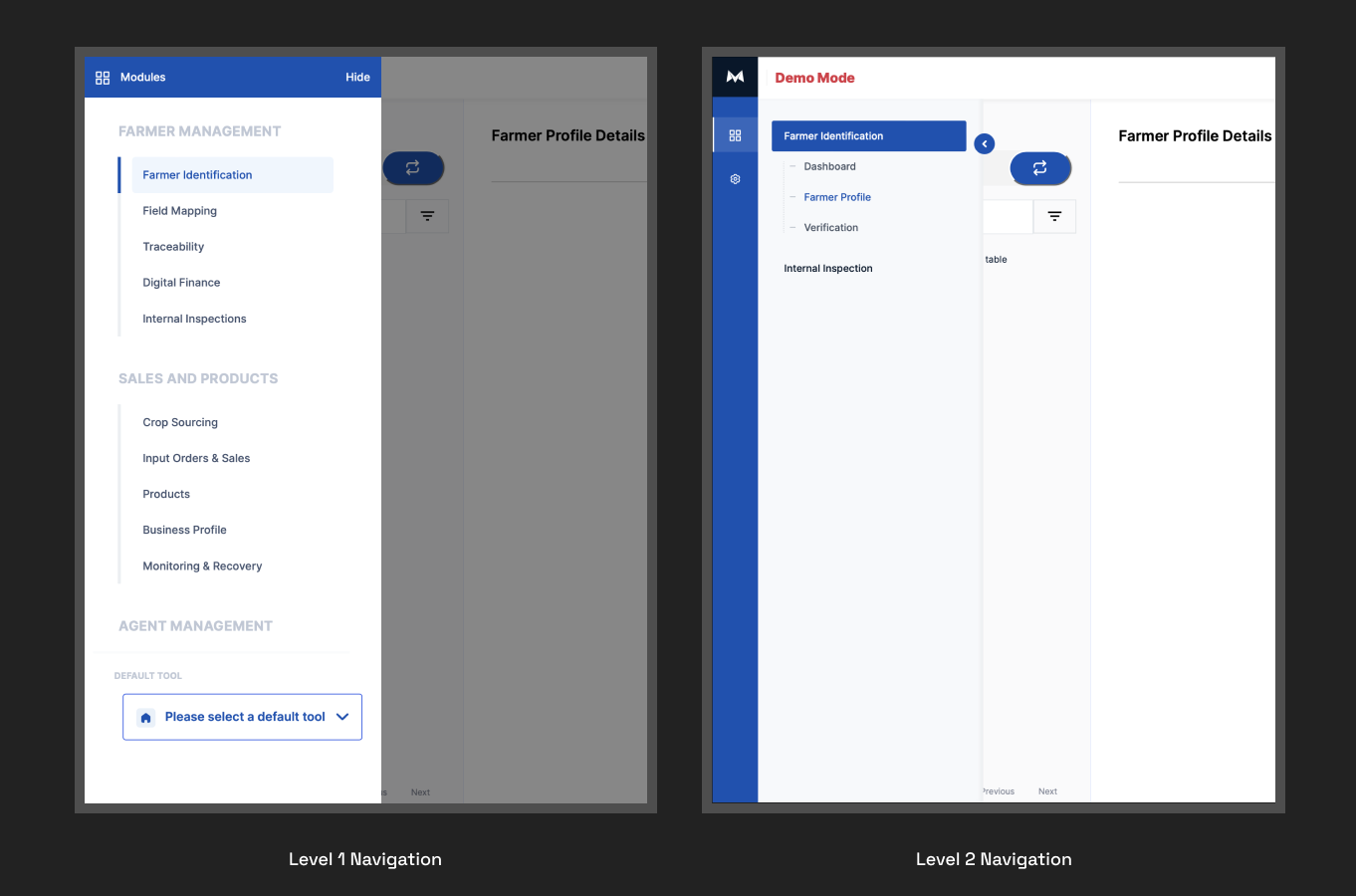
On navigation, the complexity stemmed from the long list of menu items that make up the Level 1 navigation and how less accessible all Level 1 navigations are. This complexity prevents users from having a quick overview of the modules and increases the average time to access these menu items.
On the other hand, design inconsistencies occurred from the inability of the existing design system to cater to the growing needs of Mergdata. So, upon joining the Product team, the design direction was quite clear - Mergdata Design System and Mergdata Redesign.
In redesigning the Mergdata Design System, there were stakeholder engagements (engineering, product, communication and customer experience) to get an understanding of modules that make up Mergdata, operations, processes, communication and branding. These engagements provided clarity on component designs.
The initial design system was also lacking in the core components of a design system such as guide to using colour, typography, iconography, grid, spacing amongst others. This lack of core components sets the precedent in the inconsistencies.
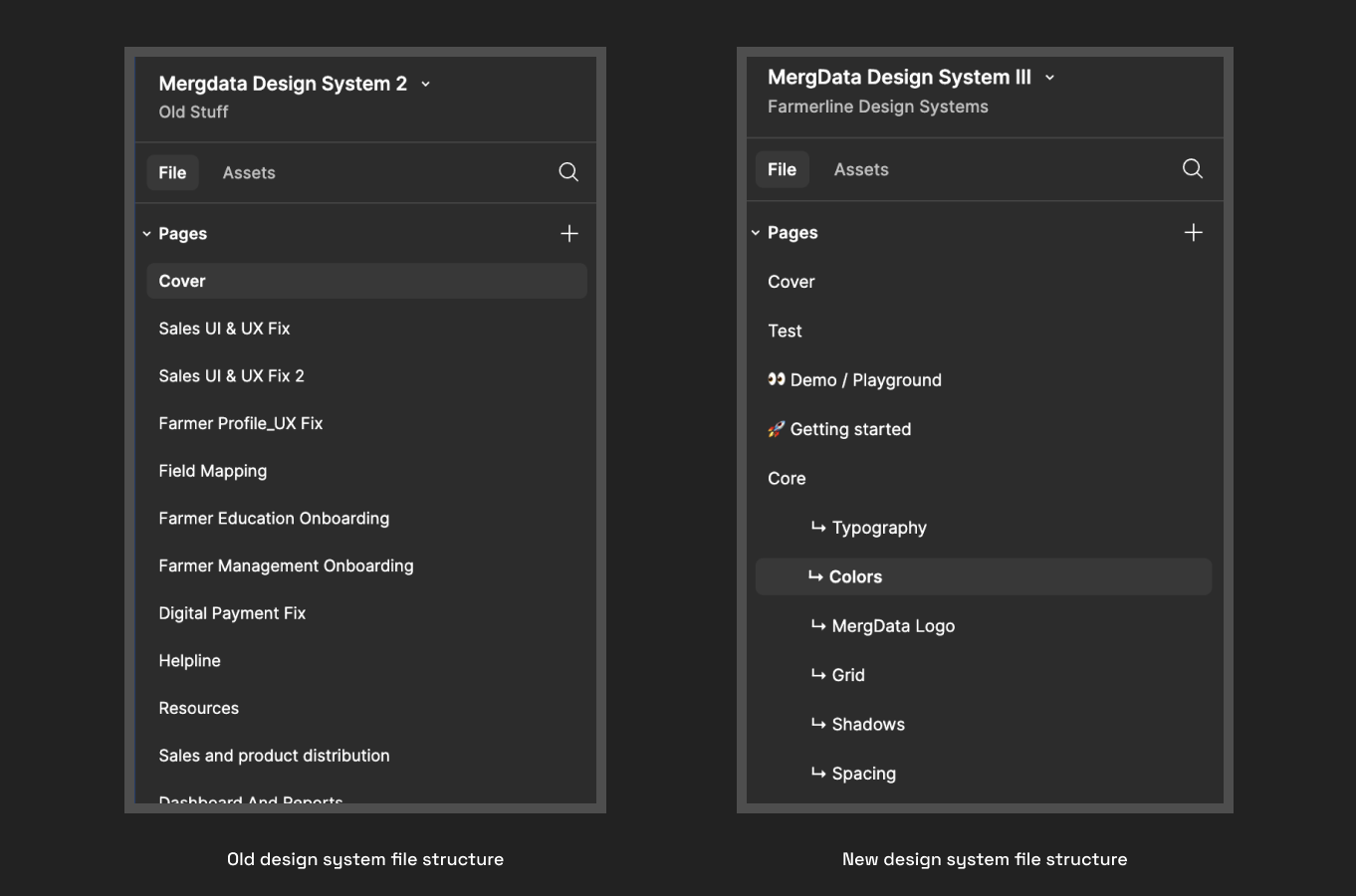
The Farmerline Brand Guideline is extensively documented and as such provided the foundation for the styles we would be creating in Mergdata Design System.
Mergdata serves a wide variety of clients, some of which require the customization of Mergdata with their brand. So on the theming, it was important for us to create a colour system that allows these scalable customizations.
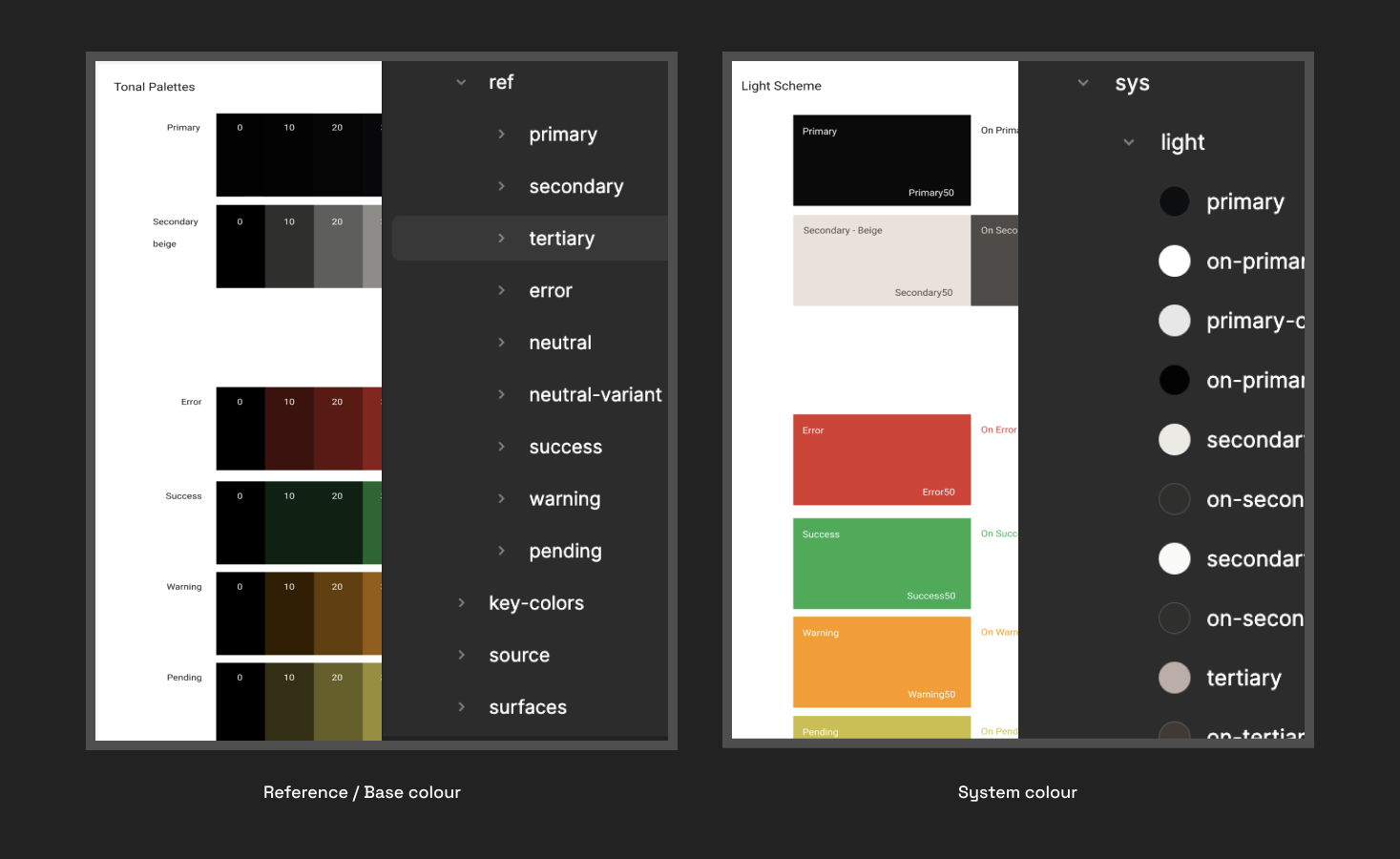
In setting this up, we created a reference and system colours. The reference colours as the name implies are a palette of colours including the brand colours with variants of light and dark. These reference colours are not used directly in the interface designs, rather they provide the foundation and the diversity needed for the system colours.
The naming convention played a significant role in how the reference colours were used to generate the system colours. Following Material Design guide, the naming pattern was simply; theme (light or dark)/colour-usage.
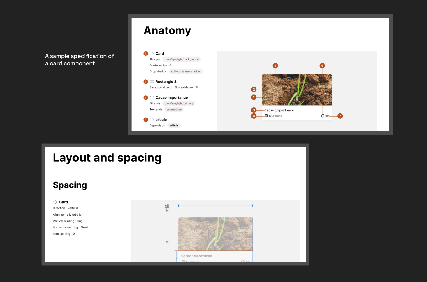
Beyond designing the UI components of the Mergdata Design System, to ensure consistency across designs in Mergdata, we documented the specification - anatomy, properties, and spatial system - of components designed. This specification provided a clear guideline on implementation and how to modify instances of the components in designs.
Recalling the key challenge with old Mergdata which was complex navigation of Mergdata Modules. In solving this, we attempted to move away from the side navigation to Top Navigation.
The Top Navigation provides a quick overview of all modules without the need to scroll, and users can as well easily find submodules without mix-up during scrolling by limiting the view of the extended navigation of submodules to one module at a time, as shown in the image above.
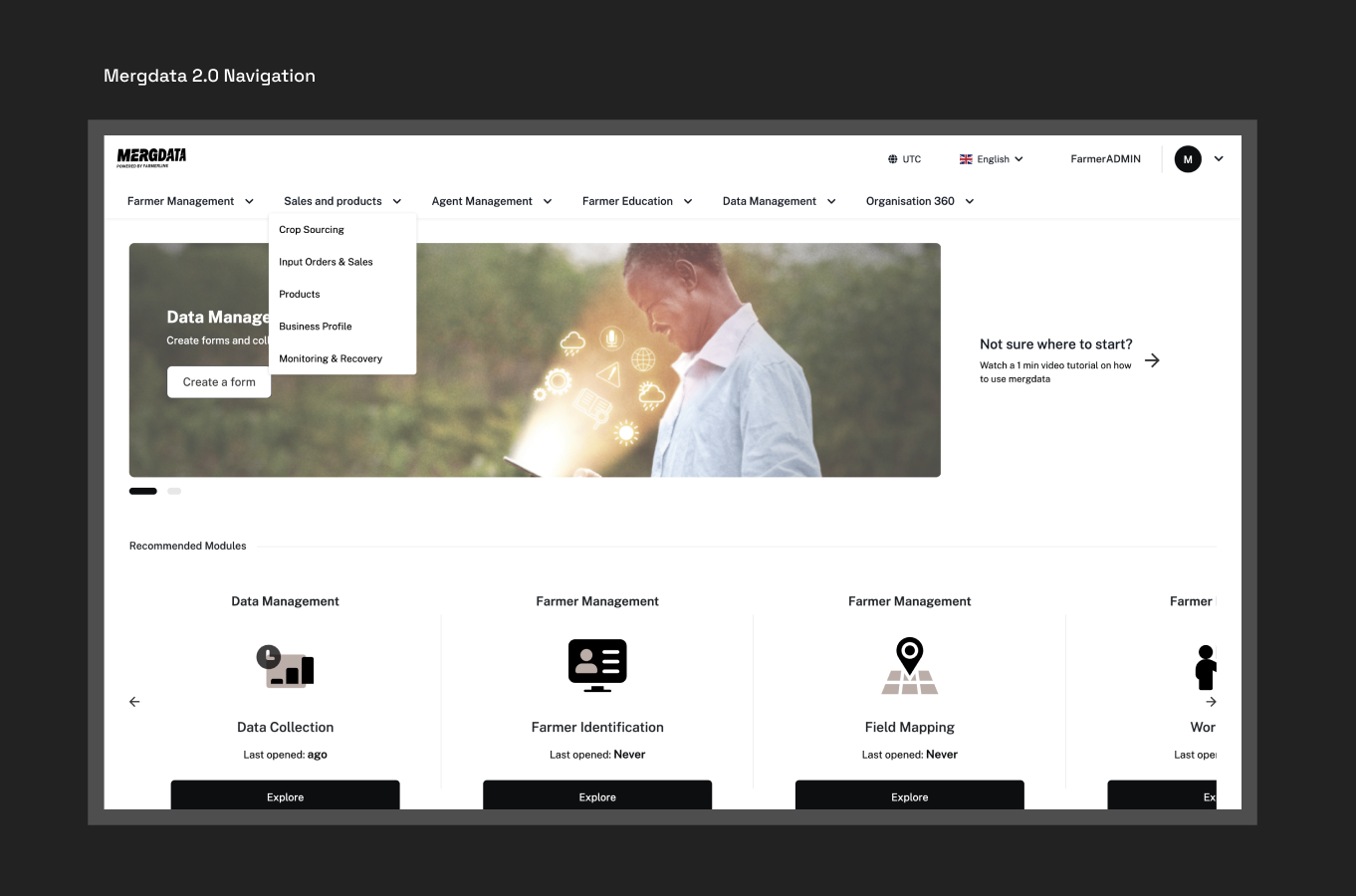
We also brought recommended modules/frequently visited modules to the Dashboard to provide users with quick access to submodules that they visit frequently within Mergdata.
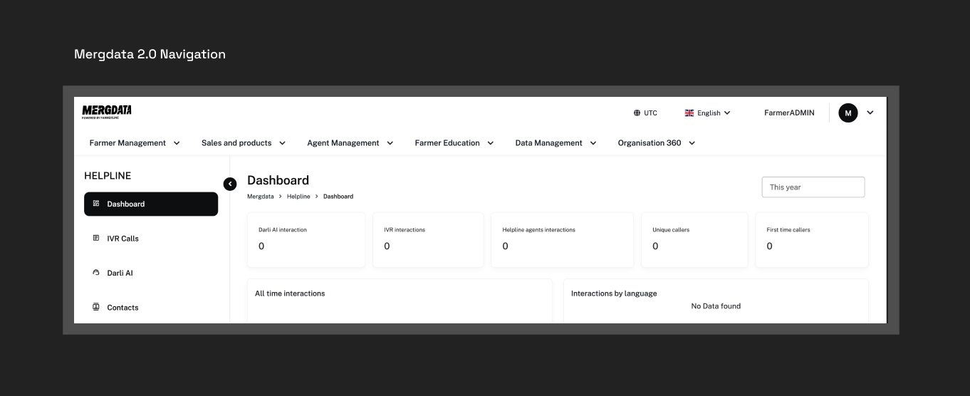
The Top Navigation also gave room for the menu items of each submodule to make up an independent Navigation on the sidebar, as shown in the image below. This has helped reduce the time for a user to navigate to either another module or a submodule because of the easy access to Navigation no matter the level of pages they are within Mergdata.
Beyond solving the Navigation issue, the rest of the design largely focused on incorporating the Farmerline Branding into Mergdata, changing from the Blue theme into the Black theme.
While being a subsidiary of Farmerline Limited, Mergdata was at the point of breaking away from Farmerline Ltd branding and having its own branding to better position it for creating the new global standard for agricultural intelligence.
The key factor in reassessing Mergdata 2.0 is the transition from Modules to Apps. Initially, Mergdata behaved as a single app with multiple modules - meaning accessing all of Mergdata’s modules is through a single entry. With being apps, the modules can then behave as a standalone product and have its point of entry while still being a part of Mergdata. Simply imagine it as how Google suites work.
With the new Mergdata Design System that has a clearly defined style system, it became quite easy to implement the new Mergdata branding. Additionally, this was the time Figma launched Variables, and with that we were able to further enforce the design consistency, particularly in the spatial system we adopted and the scalable customization of the colour scheme.
With the above, the focus of what would be the new Mergdata was to reimagine the Navigation system across the 5 applications - Terra, Darli AI, Grow MD, Collect MD and Finance MD.
In reimagining the Mergdata Navigation, we employed the card sorting technique for proper information categorisation, so we could eventually build a cohesive system that meets user's expectation. This process was a series of stakeholders engagement across different user levels to arrive at the final drafts of the Information Architecture.
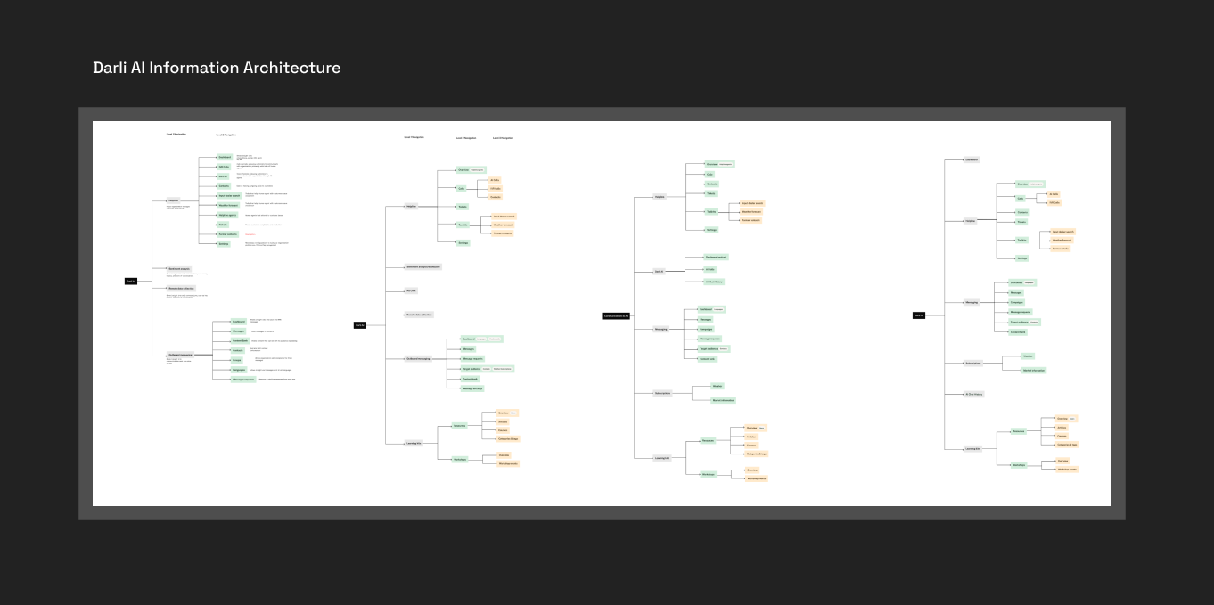
For an app, say Darli AI, as shown above, the Information Architecture helped us understand the levels of navigation there is and menu items within each of these levels. Altogether across the 5 apps of Mergdata, we could now label the navigation as Primary, Secondary, and Tertiary level of Navigations with grey, green and orange colours to represent the levels respectively.
With this label, we could create a fundamental system of how Navigation will work within each app of Mergdata, which level can contain multiple menu items and which level will have limited menu items.
With the modules now operating as independent apps in Mergdata, this comes with a new challenge of Navigating between apps for the users. In an attempt to solve this, our core goal was to reduce or eliminate the learning curve for users in adapting to the new navigation by leveraging on an existing navigation system they are already familiar with - the Google Suite's system.
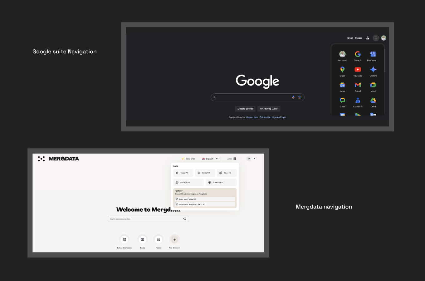
In addition to this navigation system, we included a History section that keeps track of users’ recently viewed pages across the apps on Mergdata. This history section helps to eliminate the mental struggle required and reduce the time spent to navigate to a specific page already visited within Mergdata.
On each app, we have the Top bar which holds the title of the App, Darli, as shown in the image below. The top bar also contains a search bar allowing users to search for anything within Mergdata and the “app” to easily navigate across different apps in Mergdata.
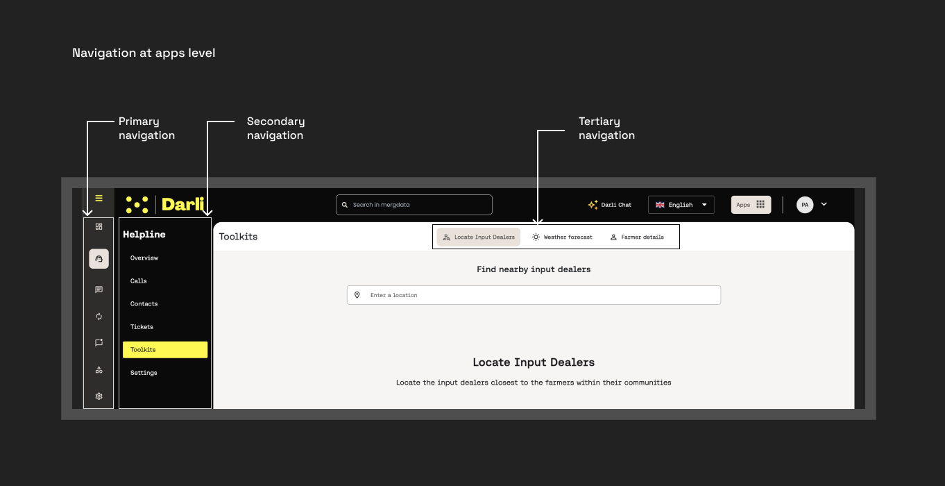
The navigation at the app’s level has already been divided into primary, secondary and tertiary level. For the primary level, we used descriptive icons to represent the items in this navigation, while also showing what each menu item entails on-hover. On the secondary level, we included a heading that will tell the active primary navigation. And for the tertiary level, we adopted a tab because the list of the menu item is very limited.
While it was a rebranding of Mergdata, the underlying issues we set out to solve were Navigation and design inconsistencies. And in solving this, we didn’t just approach it from the level of reducing complexities, we also approached it from the point of aesthetics.
The user testing conducted on the selected stakeholders across the different users level indicated positive sentiment on the ease of Navigating Mergdata and a significant improvement in the interface. In most of the user testing sessions, the stakeholders pointed out that the new Mergdata interface is making them want to use Mergdata the more.
Mergdata 3.0 was launched publicly in [Date], and the website can be accessed at mergdata.com.
I worked on Mergdata along with Pearl Adzoko.